CSS画的基本图形
2018 - 12 - 11
Posted by 青藤屋
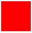
正方形
最终效果:
 CSS代码如下:
#square {
    width: 100px;
    height: 100px;
    background: red;
}
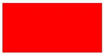
长方形
最终效果:
CSS代码如下:
#rectangle {
    width: 200px;
    height: 100px;
    background: red;
}
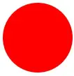
圆形
最终效果:
CSS代码如下:
#circle {
    width: 100px;
    height: 100px;
    background: red;
    -moz-border-radius: 50px;
    -webkit-border-radius: 50px;
    border-radius: 50px;
}
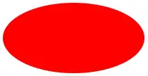
椭圆
最终效果:
CSS代码如下:
#oval {
    width: 200px;
    height: 100px;
    background: red;
    -moz-border-radius: 100px / 50px;
    -webkit-border-radius: 100px / 50px;
    border-radius: 100px / 50px;
}
上三角
最终效果:
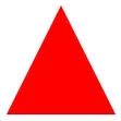
CSS代码如下:
#triangle-up {
    width: 0;
    height: 0;
    border-left: 50px solid transparent;
    border-right: 50px solid transparent;
    border-bottom: 100px solid red;
}
下三角
最终效果:
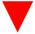
CSS代码如下:
#triangle-down {
    width: 0;
    height: 0;
    border-left: 50px solid transparent;
    border-right: 50px solid transparent;
    border-top: 100px solid red;
}
左三角
最终效果:
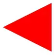
CSS代码如下:
#triangle-left {
    width: 0;
    height: 0;
    border-top: 50px solid transparent;
    border-right: 100px solid red;
    border-bottom: 50px solid transparent;
}
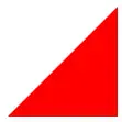
右三角
最终效果:
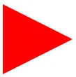
CSS代码如下:
#triangle-right {
    width: 0;
    height: 0;
    border-top: 50px solid transparent;
    border-left: 100px solid red;
    border-bottom: 50px solid transparent;
}
左上三角
最终效果:

CSS代码如下:
#triangle-topleft {
    width: 0;
    height: 0;
    border-top: 100px solid red;
    border-right: 100px solid transparent;
}
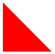
右上三角
最终效果:
CSS代码如下:
#triangle-topright {
    width: 0;
    height: 0;
    border-top: 100px solid red;
    border-left: 100px solid transparent;

}
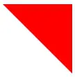
左下三角
最终效果:
CSS代码如下:
#triangle-bottomleft {
    width: 0;
    height: 0;
    border-bottom: 100px solid red;
    border-right: 100px solid transparent;
}
右下三角
最终效果:
CSS代码如下:
#triangle-bottomright {
    width: 0;
    height: 0;
    border-bottom: 100px solid red;
    border-left: 100px solid transparent;
}
平行四边形
最终效果:
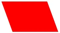
CSS代码如下:
#parallelogram {
    width: 150px;
    height: 100px;
    margin-left:20px;
    -webkit-transform: skew(20deg);
    -moz-transform: skew(20deg);
    -o-transform: skew(20deg);
    background: red;
}
梯形
最终效果:
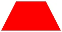
CSS代码如下:
#trapezoid {
    border-bottom: 100px solid red;
    border-left: 50px solid transparent;
    border-right: 50px solid transparent;
    height: 0;
    width: 100px;
}
六角星
最终效果:
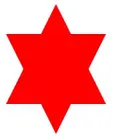
CSS代码如下:
#star-six {
    width: 0;
    height: 0;
    border-left: 50px solid transparent;
    border-right: 50px solid transparent;
    border-bottom: 100px solid red;
    position: relative;
}
#star-six:after {
    width: 0;
    height: 0;
    border-left: 50px solid transparent;
    border-right: 50px solid transparent;
    border-top: 100px solid red;
    position: absolute;
    content: "";
    top: 30px;
    left: -50px;
}
五角星
最终效果:

CSS代码如下:
#star-five {
   margin: 50px 0;
   position: relative;
   display: block;
   color: red;
   width: 0px;
   height: 0px;
   border-right: 100px solid transparent;
   border-bottom: 70px  solid red;
   border-left: 100px solid transparent;
   -moz-transform: rotate(35deg);
   -webkit-transform: rotate(35deg);
   -ms-transform: rotate(35deg);
   -o-transform: rotate(35deg);
}
#star-five:before {
   border-bottom: 80px solid red;
   border-left: 30px solid transparent;
   border-right: 30px solid transparent;
   position: absolute;
   height: 0;
   width: 0;
   top: -45px;
   left: -65px;
   display: block;
   content: '';
   -webkit-transform: rotate(-35deg);
   -moz-transform: rotate(-35deg);
   -ms-transform: rotate(-35deg);
   -o-transform: rotate(-35deg);

}
#star-five:after {
   position: absolute;
   display: block;
   color: red;
   top: 3px;
   left: -105px;
   width: 0px;
   height: 0px;
   border-right: 100px solid transparent;
   border-bottom: 70px solid red;
   border-left: 100px solid transparent;
   -webkit-transform: rotate(-70deg);
   -moz-transform: rotate(-70deg);
   -ms-transform: rotate(-70deg);
   -o-transform: rotate(-70deg);
   content: '';
}
五角大楼
最终效果:

CSS代码如下:
#pentagon {
    position: relative;
    width: 54px;
    border-width: 50px 18px 0;
    border-style: solid;
    border-color: red transparent;
}
#pentagon:before {
    content: "";
    position: absolute;
    height: 0;
    width: 0;
    top: -85px;
    left: -18px;
    border-width: 0 45px 35px;
    border-style: solid;
    border-color: transparent transparent red;
}
六边形
最终效果:
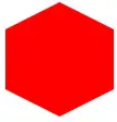
CSS代码如下:
#hexagon {
    width: 100px;
    height: 55px;
    background: red;
    position: relative;
}
#hexagon:before {
    content: "";
    position: absolute;
    top: -25px;
    left: 0;
    width: 0;
    height: 0;
    border-left: 50px solid transparent;
    border-right: 50px solid transparent;
    border-bottom: 25px solid red;
}
#hexagon:after {
    content: "";
    position: absolute;
    bottom: -25px;
    left: 0;
    width: 0;
    height: 0;
    border-left: 50px solid transparent;
    border-right: 50px solid transparent;
    border-top: 25px solid red;
}
八角形
最终效果:
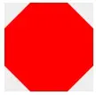
CSS代码如下:
#octagon {
    width: 100px;
    height: 100px;
    background: red;
    position: relative;
}

#octagon:before {
    content: "";
    position: absolute;
    top: 0;
    left: 0;
    border-bottom: 29px solid red;
    border-left: 29px solid #eee;
    border-right: 29px solid #eee;
    width: 42px;
    height: 0;
}

#octagon:after {
    content: "";
    position: absolute;
    bottom: 0;
    left: 0;
    border-top: 29px solid red;
    border-left: 29px solid #eee;
    border-right: 29px solid #eee;
    width: 42px;
    height: 0;
}
爱心
最终效果:

CSS代码如下:
#heart {
    position: relative;
    width: 100px;
    height: 90px;
}
#heart:before,
#heart:after {
    position: absolute;
    content: "";
    left: 50px;
    top: 0;
    width: 50px;
    height: 80px;
    background: red;
    -moz-border-radius: 50px 50px 0 0;
    border-radius: 50px 50px 0 0;
    -webkit-transform: rotate(-45deg);
       -moz-transform: rotate(-45deg);
        -ms-transform: rotate(-45deg);
         -o-transform: rotate(-45deg);
            transform: rotate(-45deg);
    -webkit-transform-origin: 0 100%;
       -moz-transform-origin: 0 100%;
        -ms-transform-origin: 0 100%;
         -o-transform-origin: 0 100%;
            transform-origin: 0 100%;
        }
#heart:after {
    left: 0;
    -webkit-transform: rotate(45deg);
       -moz-transform: rotate(45deg);
        -ms-transform: rotate(45deg);
         -o-transform: rotate(45deg);
            transform: rotate(45deg);
    -webkit-transform-origin: 100% 100%;
       -moz-transform-origin: 100% 100%;
        -ms-transform-origin: 100% 100%;
         -o-transform-origin: 100% 100%;
         transform-origin :100% 100%;
}
无穷大符号
最终效果:
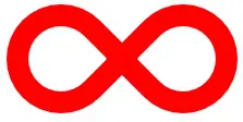
CSS代码如下:
#infinity {
    position: relative;
    width: 212px;
    height: 100px;
}

#infinity:before,
#infinity:after {
    content: "";
    position: absolute;
    top: 0;
    left: 0;
    width: 60px;
    height: 60px;
    border: 20px solid red;
    -moz-border-radius: 50px 50px 0 50px;
         border-radius: 50px 50px 0 50px;
    -webkit-transform: rotate(-45deg);
       -moz-transform: rotate(-45deg);
        -ms-transform: rotate(-45deg);
         -o-transform: rotate(-45deg);
            transform: rotate(-45deg);
        }

#infinity:after {
    left: auto;
    right: 0;
    -moz-border-radius: 50px 50px 50px 0;
         border-radius: 50px 50px 50px 0;
    -webkit-transform: rotate(45deg);
       -moz-transform: rotate(45deg);
        -ms-transform: rotate(45deg);
         -o-transform: rotate(45deg);
            transform: rotate(45deg);
        }
鸡蛋
最终效果:
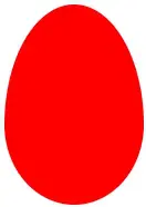
CSS代码如下:
#egg { display:block; width: 126px; height: 180px; background-color: red; -webkit-border-radius: 63px 63px 63px 63px / 108px 108px 72px 72px; border-radius: 50%   50%  50%  50%  / 60%   60%   40%  40%;
}
食逗人(Pac-Man)
最终效果:
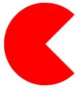
CSS代码如下:
#pacman {
  width: 0px;
  height: 0px;
  border-right: 60px solid transparent;
  border-top: 60px solid red;
  border-left: 60px solid red;
  border-bottom: 60px solid red;
  border-top-left-radius: 60px;
  border-top-right-radius: 60px;
  border-bottom-left-radius: 60px;
  border-bottom-right-radius: 60px;
}
提示对话框
最终效果:
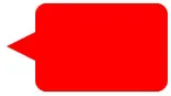
CSS代码如下:
#talkbubble {
   width: 120px;
   height: 80px;
   background: red;
   position: relative;
   -moz-border-radius: 10px;
   -webkit-border-radius: 10px;
   border-radius: 10px;
}
#talkbubble:before {
   content:"";
   position: absolute;
   right: 100%;
   top: 26px;
   width: 0;
   height: 0;
   border-top: 13px solid transparent;
   border-right: 26px solid red;
   border-bottom: 13px solid transparent;
}
12角星
最终效果:
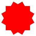
CSS代码如下:
#burst-12 {
    background: red;
    width: 80px;
    height: 80px;
    position: relative;
    text-align: center;
}
#burst-12:before, #burst-12:after {
    content: "";
    position: absolute;
    top: 0;
    left: 0;
    height: 80px;
    width: 80px;
    background: red;
}
#burst-12:before {
    -webkit-transform: rotate(30deg);
       -moz-transform: rotate(30deg);
        -ms-transform: rotate(30deg);
         -o-transform: rotate(30deg);
            transform: rotate(30deg);
        }
#burst-12:after {
    -webkit-transform: rotate(60deg);
       -moz-transform: rotate(60deg);
        -ms-transform: rotate(60deg);
         -o-transform: rotate(60deg);
            transform: rotate(60deg);
        }
8角星
最终效果:
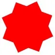
CSS代码如下:
#burst-8 {
    background: red;
    width: 80px;
    height: 80px;
    position: relative;
    text-align: center;
    -webkit-transform: rotate(20deg);
       -moz-transform: rotate(20deg);
        -ms-transform: rotate(20deg);
         -o-transform: rotate(20eg);
            transform: rotate(20deg);
        }
#burst-8:before {
    content: "";
    position: absolute;
    top: 0;
    left: 0;
    height: 80px;
    width: 80px;
    background: red;
    -webkit-transform: rotate(135deg);
       -moz-transform: rotate(135deg);
        -ms-transform: rotate(135deg);
         -o-transform: rotate(135deg);
            transform: rotate(135deg);
        }
钻石
最终效果:
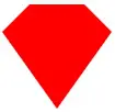
CSS代码如下:
#cut-diamond {
    border-style: solid;
    border-color: transparent transparent red transparent;
    border-width: 0 25px 25px 25px;
    height: 0;
    width: 50px;
    position: relative;
    margin: 20px 0 50px 0;
}
#cut-diamond:after {
    content: "";
    position: absolute;
    top: 25px;
    left: -25px;
    width: 0;
    height: 0;
    border-style: solid;
    border-color: red transparent transparent transparent;
    border-width: 70px 50px 0 50px;
}
阴阳八卦
最终效果:
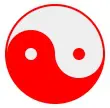
CSS代码如下:
#yin-yang {
    width: 96px;
    height: 48px;
    background: #eee;
    border-color: red;
    border-style: solid;
    border-width: 2px 2px 50px 2px;
    border-radius: 100%;
    position: relative;
}

#yin-yang:before {
    content: "";
    position: absolute;
    top: 50%;
    left: 0;
    background: #eee;
    border: 18px solid red;
    border-radius: 100%;
    width: 12px;
    height: 12px;
}

#yin-yang:after {
    content: "";
    position: absolute;
    top: 50%;
    left: 50%;
    background: red;
    border: 18px solid #eee;
    border-radius:100%;
    width: 12px;
    height: 12px;
}